
How turning a digital catalog to an E-commerce website led to a 19% increase in conversions.

UX Designer, UX Researcher, User Tester
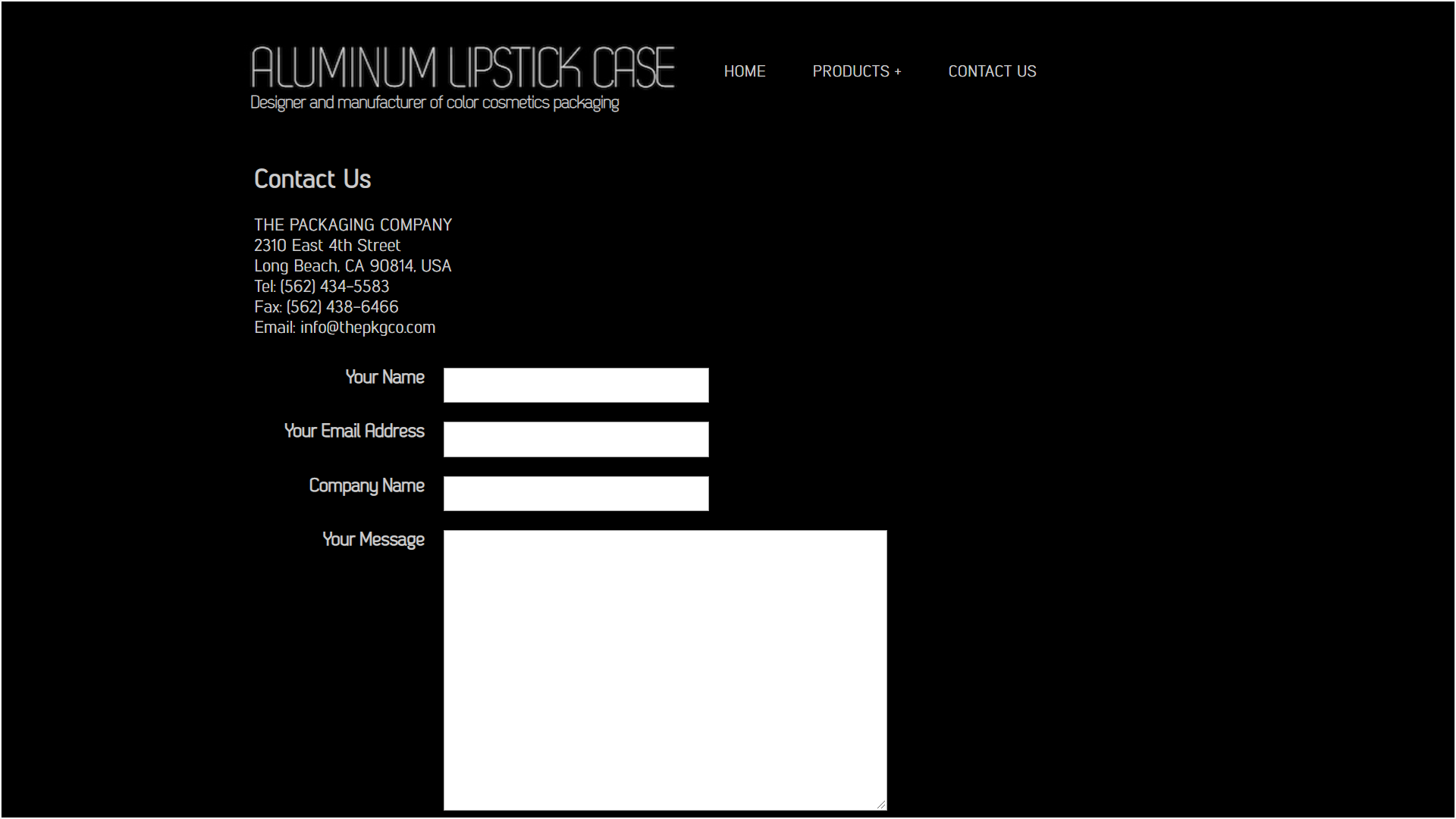
The Packaging Company
12 Weeks
Conduct user research, interviews, and tests, competitive analysis, increase traffic, increase conversions, and reach the correct target audience with our website.
Aluminum Lipstick Cases, one of The Packaging Company’s lead generating websites, served as an online catalog for cosmetic packaging. Despite 25+ years of industry expertise, the site didn’t reflect our adaptability to trends.
A modern, easy-to-use, and presentable website is critical for business. Thus, I lead the total redesign of the Aluminum Lipstick Case website to make the process of getting a quote easier for users. I also rebranded the company so that the website would accurately reflect our professional service and extensive expertise.


The website plays a critical role in converting visitors into customers. If the user can’t find what they’re looking for or are just unimpressed with the website, they’ll return to their search results to find something else. Most importantly, because the company is a design service, a poorly presented website will cause a lack of trust for customers.


The website looked very outdated and didn't have any indication that it was actively updated or serviced. We also received a lot of inquiries from the wrong type of customers because it wasn't clear that we only sold in large quantities of 5,000-12,000 units or more.
Our website functioned more as an image gallery and required users to copy and paste or write down the item number to submit an inquiry. There was not enough text for search engines to pick up on, which caused poor SEO results.
Customers needed to write down the item number of the products they were interested in and submit their inquiry as an email. This process was not efficient, especially when a customer wanted quotes for multiple products.
Building an e-commerce website greatly enhanced our SEO, as written product descriptions allowed our site to rank higher in search results.
Customers could also add items to a cart and request a quote directly, removing the hassle of manually noting SKUs and reaching out separately.
This improvement streamlined the process, reducing time spent on unqualified leads and ultimately increasing our conversion rate.
.png)

We successfully increased traffic and session durations on our website and reduced the bounce rate. All new incoming quote requests and meetings were with clients who understood and accepted the minimum order quantity and lead times. As a result, productivity increased due to less time spent on leads who didn't end up buying from us.
To better understand our audience, I first interviewed existing clients to learn how they found us, what they were looking for, and how they felt about their inquiry process. I was able to identify the extreme users and their concerns, which helped me select my three personas.


I started researching our competitors to learn the following:
Our leading competitors were Fusion PKG, Raepak, and HCP Packaging. I teamed up with our visual designer and created a SWOT analysis and user journeys for each competitor. We drew inspiration from solutions that appeared to work for them and omitted ones that did not work for us.


I documented the steps our users took to accomplish the goal I assigned to them and the obstacles they experienced that made it challenging. Then, I created a new user flow to simplify the inquiry process from navigating through 7 pages down to 3 phases.

The first step involved extracting key information from the images and creating dedicated product pages for each item. This approach enabled us to leverage meta tags and text to enhance SEO while also providing more detailed and informative descriptions. Additionally, it ensured a consistent and uniform presentation of information across all products. Customers can now request quotes directly on the item’s detailed page with a pop-up form. They no longer have to remember the item number and navigate to a separate page.


I arranged the product list to flex between 2-4 columns based on the resolution for better presentation. During my A/B test, I found that users prefer a pagination view of the products instead of the endless scroll because it served as a placeholder when browsing our extensive inventory.

Customers can add multiple products to their baskets. Then, once they are ready, they can submit the quote inquiry on a single form instead of sending numerous inquiries.

The rise in qualified prospects led to fewer low-intent inquiries, as non-prospective clients were no longer submitting quote requests. All incoming requests and meetings were with clients who already understood and accepted our minimum order quantities and lead times. This shift boosted productivity by reducing time spent on unqualified leads and ultimately led to a higher conversion rate.

.png)
High-quality images of the product replaced the ones used on the old website. In addition, I included the product description, details, and minimum order quantity in the copy. Finally, key terms were added to every item and their META Tags to improve our SEO and provide better clarity to our clients. Customers could now browse and filter items more efficiently, allowing them to quickly find what they needed. Key product information, such as item names and numbers, was no longer embedded in images, making it more accessible and improving the overall user experience.
.png)
Additionally, customers could add items to a cart and submit a quote request directly, eliminating the need to manually record SKUs or navigate to a separate contact page. This streamlined process led to increased website traffic and session durations while reducing the bounce rate.
.png)
The old design was not responsive, making it nearly impossible for mobile users to navigate. The new design was responsive on desktop, tablet, and mobile devices.
I learned to work with limited resources and no budget.
During my research, I found that customers valued the website’s presentation—critical for a design company. However, we lacked high-resolution product photos for the portfolio.
Despite the challenge, I collaborated with our designer to create professional images. After the redesign showed success, I persuaded our COO to prioritize higher-quality content for future projects.
The next step would be to further research how to best reach the ideal client or persona because the goal is to increase the number of inquiries from the target demographic.
Looking back on this project with more experience, there are several things I would change.
First, the consistency of CTAs and copy. This was my first redesign, worked on in my free time, without a proper design system—so inconsistencies were inevitable. For example, “Inquiry” and “Enquiry” were used interchangeably throughout the site.
Second, I’d update the CTA button to say “Get a Quote” for clarity. “Inquiry About This Item” was awkward and, frankly, didn’t make much sense. I remember staring at that word for so long that it lost all meaning. Since then, I’ve gained a better understanding of effective CTA phrasing.
Third, I’d refine the typography for consistency and stronger content hierarchy. At the time, my approach to style guides and design systems was still developing—I relied mostly on what looked right. While it wasn’t terrible, I now see how much better it could be.
