
Inkling's Workflows
Inkling's employee training platform revolutionizes mobile learning, granting immediate access to vital training and resources that enhance customer interactions. By digitizing training and knowledge manuals and documents, Inkling drives better performance in today’s dynamic business environment.
I was part of a project to create a way for users to manage their tasks through a digital checklist, helping them adhere to their guidelines and complete their required tasks.

Project Details

Role
Lead UX Designer, UX Research, Design Sprint Participant
Company
Inkling
Duration
8 Weeks
Role & Team
Customers couldn't track their employee's workflows
Customers wanted a unified platform for assigning training materials and forms, rather than juggling multiple tools. Our platform lacked a central hub for management to review data and gather feedback efficiently and could only collect qualitative text entries. The existing form captured only one submission at a time, with users facing progress loss due to connection issues.
With customers exploring alternatives, our renewals with them were at risk.


Solution
We aim to offer customers a shared workflow that allows users to track and demonstrate a series of completed tasks over time. This will enable collaboration across teams and departments, with the checklist being used for onboarding, sharing feedback, preparing meetings, and more.


Results
This solution reduced the time users spent on forms and improved data accuracy, enabling more efficient task completion and allowing for detailed data collection. The feature’s launch led to several Fortune 500 customers renewing their contracts, thanks to its ability to collect valuable data and reduce employee turnover by addressing key pain points in the existing process.
What were we missing?
Before starting the design process, I collaborated with our CSM, who represents the voice of our users. Together, we focused on understanding not only the specific requests from users but also their frustrations with the current form, which led them to seek a more robust solution to better support their tasks. Our current method has a series of issues with tracking the workflow of users.
Lack of Collaboration
Difficult to collaborate on one form between multiple devices or users.
Inability to Save Progress
Loss of data as users experience wifi dropping, time-outs, or trading devices.
No Data Reports
Poor access to and distribution of collected data.


Interruptions in the Workplace
In the workplace, employees are often interrupted by tasks requiring immediate attention, and those working away from desktops risk losing connection. With our existing platform, users were frustrated because their progress would be lost unless they submitted the form.
This led to wasted time and effort as they had to start over. It was a major concern for customers, who worried this experience could contribute to higher employee turnover.
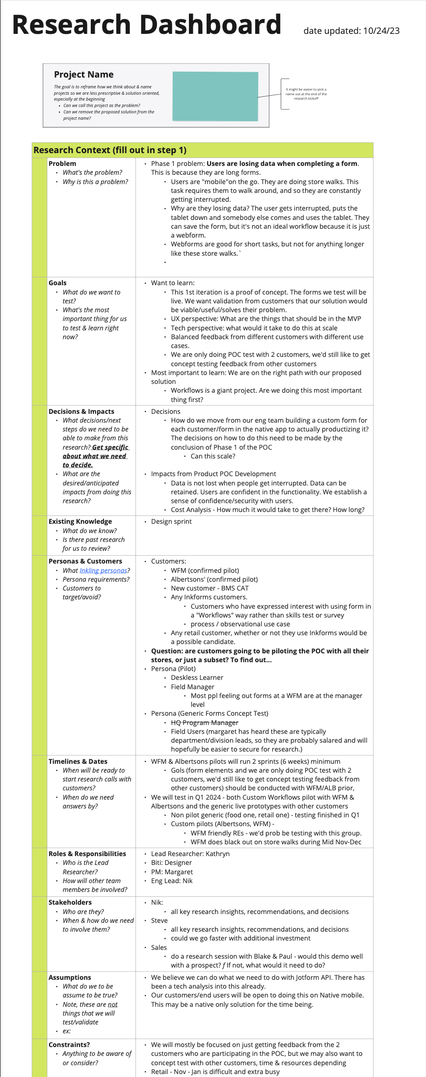
Design Sprint
I asked myself a few basic questions to kickstart the project:
- What are typical objectives for the employees/trainees?
- What are they currently doing on our platform and how do they manage the data they have to work with?
- How do other systems manage their form submissions and can we apply that to our platform?
- What kind of information is usually collected?
- For those that are using it to report back on walkthroughs and protocols, what do they do when a problem occurs?
The answer to those questions were fleshed out during our Design Sprint. It helped us identify our objectives and provided a structure for our user journey. From there, we determine the features that would help our users attain their goals through storyboarding the difference scenarios.

How Might We's & Goals
Understanding our user's journey with how they manage their workflows helped us identify the phases how we would improve on their experience and meet their goals.


How Might We's
How might we standardize a solution that allows some level of customization?
How might we alleviate employees dealing with multiple tasks in their workday?
How might we improve the view/retrieval of data out of submissions?
Goals
Create a brand new form that helped users submit feedback efficiently and ensure the data submitted can be retrieve and presented in reports.
Provide a way for users to flag issues and bring them to the immediate attention of higher ups.
Ensure that users can easily return to their work in case of any interruptions.
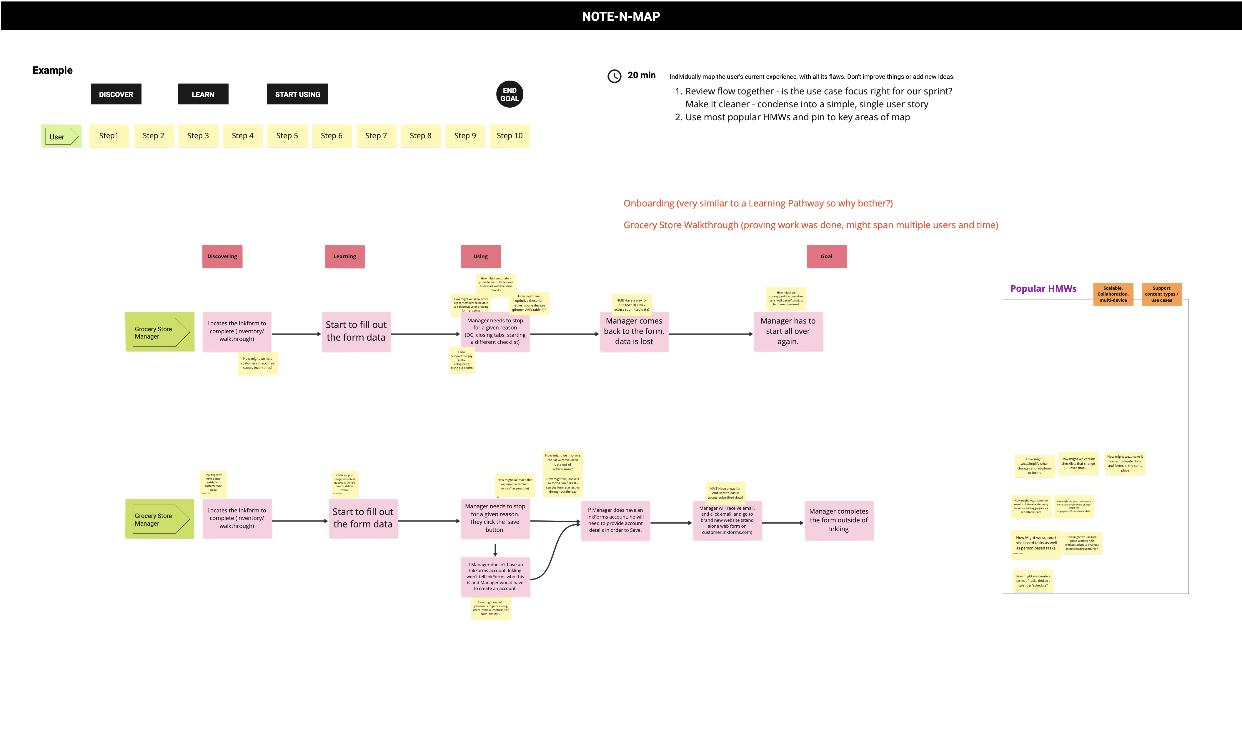
The User's Journey
We mapped out the current user experience to identify pain points and areas for improvement. Collaboratively, we refined the flow to assess whether this use case was the right focus for our sprint. From there, we selected the most agreed-upon HMWs (How Might We statements) to highlight key opportunities within the mapped journey and created a new flow to storyboard.

Inspirations
As part of the design sprint, we explored demos of existing products to identify effective solutions for this feature. Two standout examples were Google Forms and JotForm, both of which offered robust authoring tools capable of efficiently generating reports from collected data. Through our analysis, we found that these solutions aligned closely with the type of data our customers aimed to collect from their users, reinforcing their relevance as strong reference points for our design.


MvPs & Storyboarding
We analyzed customer needs and employee workflows, identifying that most users would complete tasks on tablets while onsite. We then outlined essential features for form completion and report generation, prioritizing those feasible for the MVP launch through voting. Finally, we are able to storyboard our new flow.


Design Decisions
Since the feature's primary use would be on mobile devices, particularly tablets, I led the design by incorporating best mobile practices for the features we had voted on. I ensured the design was simple and scalable across different platforms and devices.


Auto-Save Feature
As mentioned, customers were particularly vocal about data loss being their biggest pain point.
To address this, I collaborated with our engineers to implement an auto-save feature and designed the state changes to build trust and reassure users, who had been concerned about losing their work. Additionally, I included a "Save" button as a fallback for cases where the auto-save feature might fail.
Centralizing the Forms
Previously, users had to navigate to their assignment to find their form if they were interrupted. It took them going through several pages before they could find their work. Now, they can easily access any forms they've been working on directly from the home page or from an archive of all their active forms.

Data Collection and Reports
From the design sprint, I gained insights into the types of information customers wanted to collect, leading me to create various question formats to standardize the collection of both quantitative and qualitative data. We also integrated geo-fencing to automate location-based information, improving both efficiency and data accuracy. Additionally, we introduced a feature that allows users to flag items requiring immediate attention from their superiors, helping customers gather data on any issues that arise as feedback.
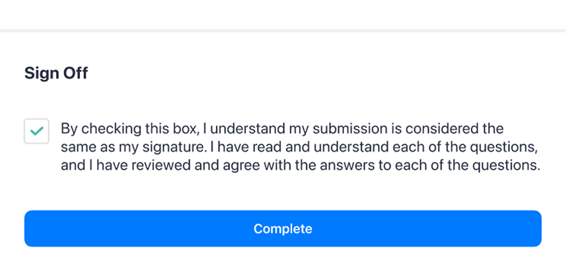
Signature
These submissions required user sign-off. The first iteration used the existing signature input, which asked users to scribble their signature—a tedious process, especially when using a mouse on the desktop platform. To improve the experience, I replaced the signature field with a simple checkbox, eliminating the hassle of the traditional signature input.

User Testing & Findings
Outlining Our Objectives
I worked with our user researcher to prioritize the key things we wanted to test which included:
- What are the most important question types that need to be included to give customers the data they need?
- As an end user, do I have greater confidence in workflows than web-based forms?
- Do checklists need to be shared across users (users not working on it at the same time)?
- Are we over indexing on requests from specific customers or can all of our customers find value in this form?
- How might we make the results of onsite walks easy to share and aggregate as reportable data?


Key Points Validated
- The UX of Workflows prototype is superior to the existing forms because it's a self-contained, native product solution
- Live save status and auto-save features were immensely helpful
- Assigning issues as trackable action items seems very useful
- Pre- fill fields saves users time, and increases accuracy of data
- Onboarding, skill re/assessment, and operations are areas customers are investing resources in
New Findings
- There appears to be a conflict in use-cases against our product features (using the wrong tool for the job could undermine Inkling as a solution)
- Avoid utilizing email-based features in solutions since many companies did not utilize work emails
- Checklists are expected to be assigned to the user rather than selecting them at will
- Checklists could be dynamic/conditional to existing data (e.g. time, place, or user role)
What's Next?
Our initial launch enabled users to submit forms and generate reports based on collected data, streamlining how customers analyzed employee workflows without reviewing each submission individually. However, the system lacked a proper pipeline to notify recipients of flagged issues, which required further refinement.
Our next step is to research how customers manage internal communication and prioritize reported issues — distinguishing between those that simply need to be logged and those requiring immediate attention — to design an effective notification system for managers.
Project Reflection
Overview
Overall, I believe we created a product that meets customer needs and provides an intuitive experience. The MVP focused on form and saving features, though I wish I had more time to refine user flows, especially for organizing completed tasks. Despite this, I'm pleased with the design, which helps users collect data and avoid losing progress. While the form doesn’t cover all industry needs, it was the first phase, with plans for future expansion.
What I Learned
One of the most valuable lessons I learned from this project was the importance of maintaining strong communication with our product managers and customer service managers. This feature was new to me, and working closely with them helped me understand the existing feature, its limitations, and how to respect the client's perspective and experience.